Studio apartment in the style of "loft"
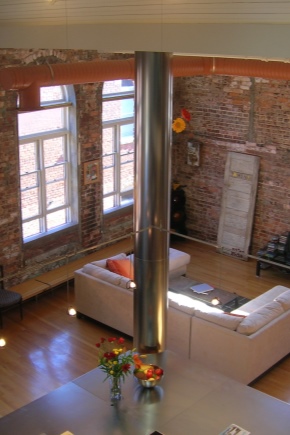
Loft is one of the modern interior styles. It appeared during the conversion of industrial buildings into residential ones. It happened in the United States, literally Loft translates as an attic. In the article we will consider the features of this style, to whom and for which premises are suitable, principles and examples of design.
Special features
The history of the loft determines that it best fits into an apartment with a free layout, high ceilings and large windows, as well as in the attic room or building after reconstruction.
The principles of design originated in the city, therefore, have an urban character and are not suitable for a country interior.
Strictly speaking, in small model apartments the use of this style will be imitative in nature with the transfer of basic features and ideas.However, with the right approach and the use of materials and finishing techniques characteristic for it, the result will be quite worthy of being called a loft style.
Such a design should have a number of features:
- active use of gray, brown and terracotta colors;
- minimalist furnishings;
- surface treatment with plaster and paint;
- open structural elements: masonry, ventilation pipes, beams, etc .;
- furniture and decoration can be in different styles;
- the décor is usually urban: graffiti, posters, various metal objects, etc .;
- furniture as simple and functional as possible.
Monochrome colors and bright accents can also be noted among the signs of style. And in lighting, lamps are often used, in plafones or without them, suspended on cables.
Answering the question to whom this style suits, we can say that these are people who:
- They love freedom and a lot of space in the room;
- Prefer coarse texture;
- Do not appreciate stucco and gilt in the interior.
He does not like those who love the traditions and classics, for example, patterned or floral wallpaper, statues and vases as a decor.
Finish
The concept of style dictates the need to use certain materials and methods of surface treatment.
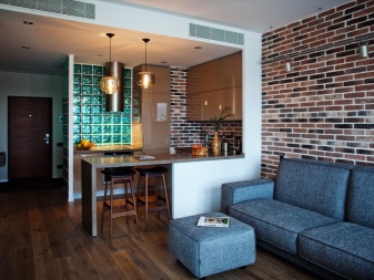
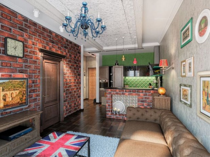
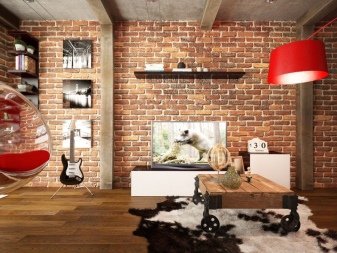
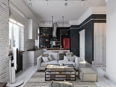
So, the walls are covered with plain paint, plaster, wallpaper for painting. Different colors or shades are used mainly for zoning the kitchen-living room. The main element of the wall decor is brickwork. To prevent shedding of the solution and dust, it is varnished.
For those who want to add decoration, but do not lose the main idea of stylistics, the use of white brick or paint will be a good alternative.
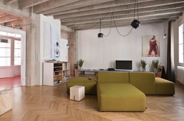
The ceiling can also be painted or plastered. Wood or metal ceiling beams and other communications are actively used: pipes, ventilation and wires.
For the floor is best to use floorboard or laminate. The latter should look as natural as possible. It is desirable to lay the coating directly, and not diagonally. Will harmoniously fit into the design and ceramic tiles, especially matte.
When choosing different finishing options, the most important thing to remember is that the central idea is the proximity of raw surfaces with modern materials, techniques and design elements.
Interior and furniture
As we have said, when designing the interior one of the main ideas is minimalism in the decor and furniture.
The windows, in the strict version, are made out of roller blinds or are completely left without them. But in some cases, the use of light transparent curtains will create a spectacular contrasting combination.
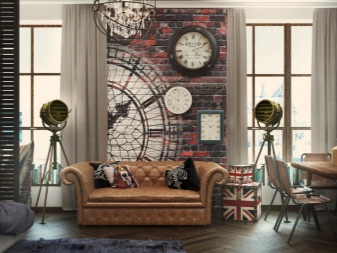
It is best to decorate the walls with large posters or paintings in simple wooden or metal frames. The images of people, city, transport, as well as abstraction, avant-garde and graphics will successfully fit in.
Decor items must be carefully thought out. It is important not to overdo it with their number and appearance. It is best to use what is made of metal, such as table lamps and floor lamps. In a certain situation, you can even use real parts from cars, motorcycles or bicycles.
If you want to add tradition, suit laconic vases with dried flowers, bright pillows, mirrors of different geometric shapes, decorative metal objects in the form of a sphere or a cube.
In principle, everything that comes to hand can be suitable for decoration, as if it was really “found in the attic”.But here the main thing is to competently arrange these things among themselves and with the overall design.
Furniture should be only the most necessary. In the kitchen-living room is a sofa, a TV table, a coffee table, a dining table with chairs or a bar with high stools. If there is a desire or need, you can put chairs and shelves. It should be remembered that the clutter of space can affect the overall style.
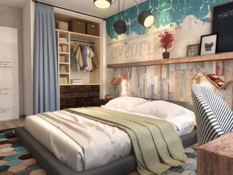
In the bedroom: bed, wardrobe and bedside tables. The latter may not be. A good alternative to standard models will be thumbs in the form of stools. Ideally, you need to equip a dressing room in which you can place a dressing table.
When choosing furniture it is important to choose the right color. A bright red sofa will be difficult to fit into the overall concept - this bright spot will score all around. It is better to give preference to dirty shades of yellow, blue or green, variety of red-brown and brown scales. If you want to add lightness and lightness - white and beige.
It is well suited to stylize the old American furniture. But this is a matter of taste, and modern minimalism with plain colors and simplicity of forms will be an excellent alternative.
Design examples
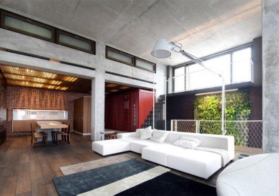
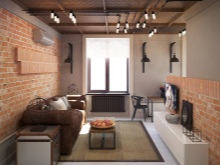
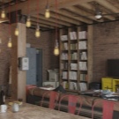
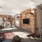
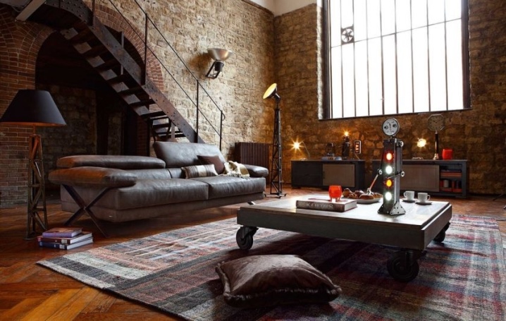
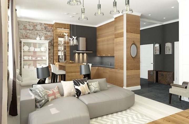
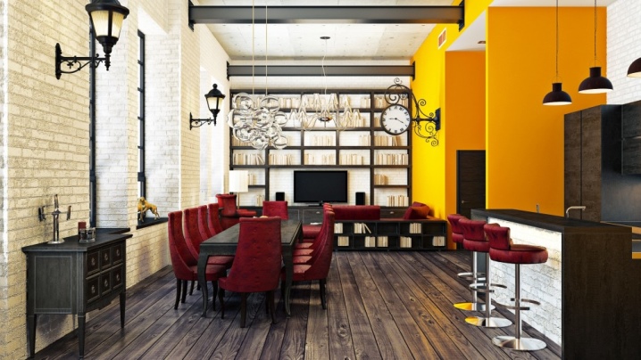
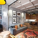
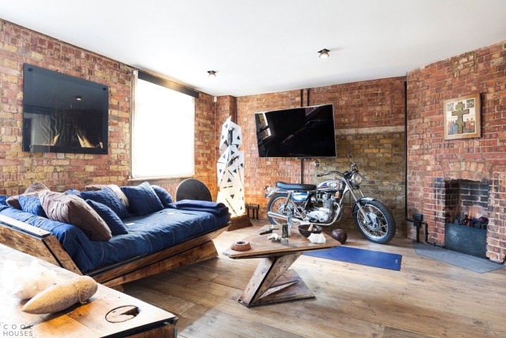
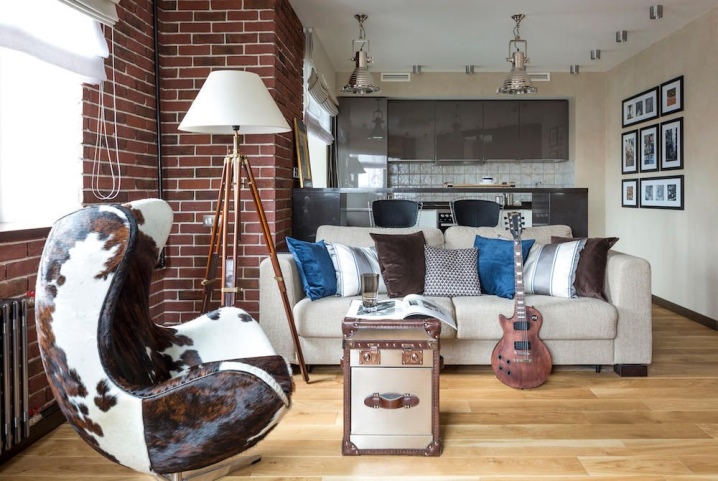
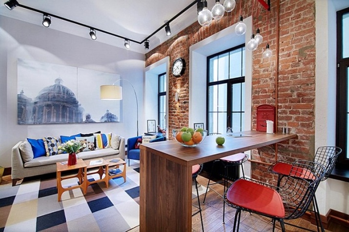
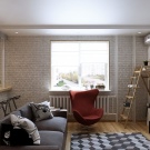
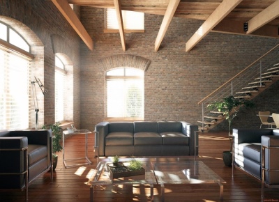
A classic example of a loft-style design: brick walls, wooden roller blinds, floor and beams under the ceiling, large windows with a characteristic frame of the opening and only the most necessary furniture.
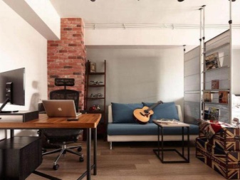
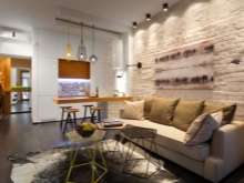
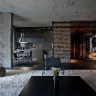
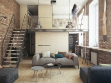
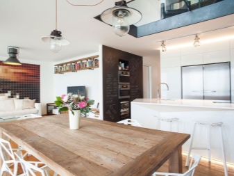
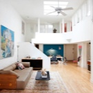
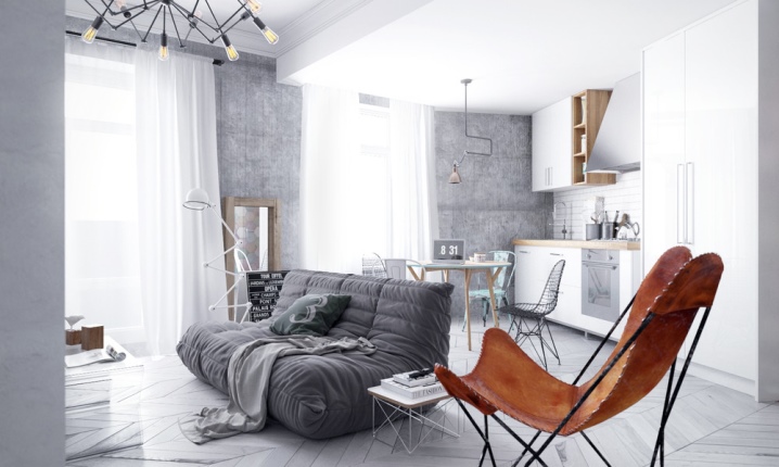
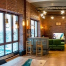
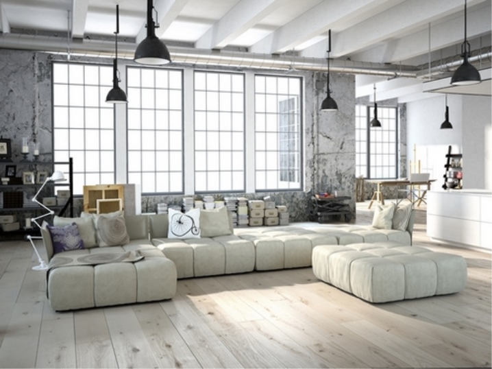
The next option is just suitable for those who are urbanistic design and at the same time loves light colors. The characteristic features here are lamps on long cables, a metal pipe and beams on the ceiling, decorative plaster “under concrete”, a metal rack, books and stylized boxes stacked on top of each other.
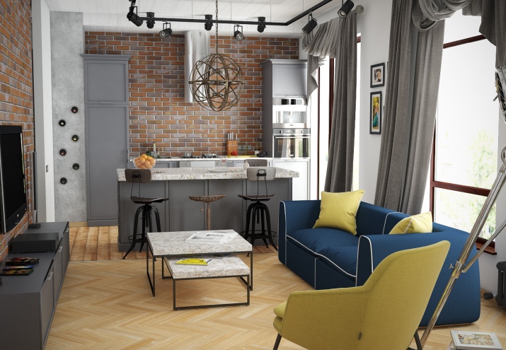
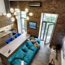
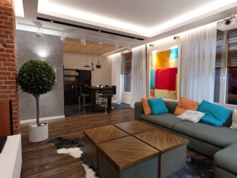
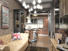
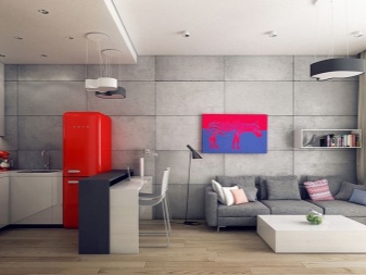
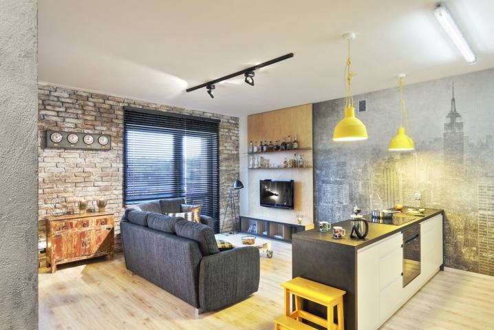
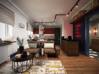
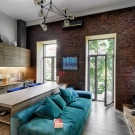
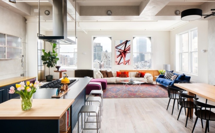
In conclusion, consider the interior with numerous bright accents: a poster with an industrial metal construction, red and striped pillows, a blue sofa, a yellow teapot and even tulips. These items are surprisingly harmonious and attractive look under the metal structure of the duct on the ceiling and light walls "under the unpainted plaster" in the kitchen area. I would also like to note the combination of furniture: square, round, different textures and shades.
