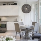
Kitchen design studio
In many new-built apartments with a modern layout, the living room, dining room and kitchen are initially a combined space, suggesting their design in one stylistic decision. With the help of redevelopment, you can equip in a similar way and a typical apartment.
Let us find out in more detail what a studio kitchen is like and how to beat a multifunctional zone in one style with a competent distribution of all the necessary segments in order to get a harmonious and stylish image of an apartment.
What it is?
The kitchen-studio is a trendy western trend that gradually got to us and was enjoyed by the Russians because of its exceptional convenience and practicality. Combining two or more rooms into a single space has become a popular design technique, with which you can expand the possibilities of housing.
For owners of small apartments, where the area of the living room or kitchen is more than modest in size, this decision is of particular relevance. By combining the kitchen and adjoining rooms, and often a corridor joins them, and partly the entrance hall, you can comfortably accommodate not only the household itself, but also the guests.
Advantages and disadvantages
The combined hall-kitchen option, like any solution in the arrangement of living space, has its advantages and disadvantages.
Positive sides:
- As a result of such transformations, a single bright, spacious room is obtained. with the ability to distribute the functional load between several zones.
- If the apartment has a small kitchenthen by connecting the adjacent room, you can equip the dining segment in the immediate vicinity of the worker. In this case, it is much easier and more convenient to set the table, change dishes and clean up after eating.
- A significant reduction in traffic saves time hostess. She can, without looking up from work in the kitchen, at the same time devote time home or look after the child.
Negative points:
- The cooking process is inevitably accompanied by sounds and smells.which, one way or another, will be delivered to the hall.
- Financial issue. If you need a serious redevelopment, you will need to demolish the walls and strengthen the openings, which entails additional costs.
- Coordination with BTI. Dismantling of the bearing floors can not be carried out without the appropriate permission, and obtaining it often takes not only forces, time and money, but also nerves.
In general, proper planning of the location of functional areas in the same room allows to extract from a solution such as a kitchen-studio, the maximum practical benefits.
Space organization and layout options
The network is replete with design projects of kitchen studios, borrowed mainly from foreign resources. And all would be nothing if it were not for the tangible difference in the mentality of the average Russian and Western housewives.
In most cases, residents of the United States and Europe will use the kitchen for the quick preparation of some plain food or just to warm up the semi-finished product before serving.Our ladies use the kitchen in full, at least three times a day tacking the refrigerator-cooker-sink route to provide a large family with a full breakfast, lunch and dinner. Therefore, kitchen set and household appliances should be placed according to all the rules of ergonomics.
In addition to using zoning techniques, you can properly organize the space using:
- Furniture. Angular-type sofa models or modular designs are the best solution;
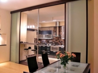
- Sliding partitions, compartment doors, screens, shelving designs;
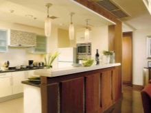
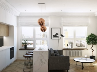
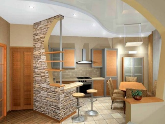
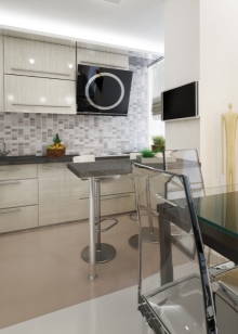
- Bar counter as an effective addition to any interior solution;
- Fireplace - in spacious rooms;
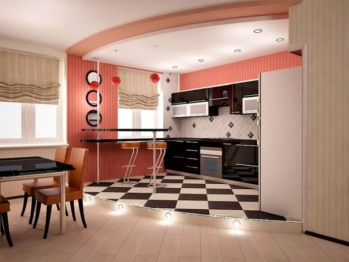
- Podium for visual distribution of space into segments, and if the kitchen is small, then this detail will play the role of an additional storage system;
- Stationary glass or plasterboard partitions for creating decorative niches or arranging a secluded recreation area;
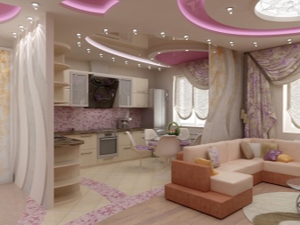
- Multi level ceiling as an opportunity to diversify the interior and one of the methods of zoning;
- Mirrorswhich will increase the brightness of natural light and create a spectacular optical illusionincreasing the area of the room.
One more key moment of arrangement of the combined space is planning.
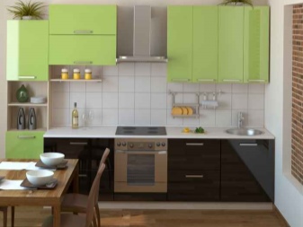
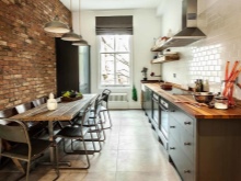
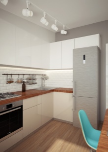
- Linear. Here, the main components of the furnishings - kitchen furniture, work surfaces, household appliances are arranged in one line, located along the wall. The layout in one row is convenient to use in the kitchen-studio of a small size.
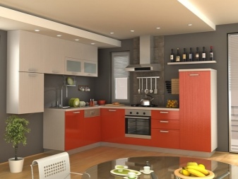
- Corner. It is advisable to use in a two-room apartment, provided there is no shortage of free space. This is the most versatile version of the layout components of the situation. Kitchen set and work surfaces have along adjacent walls, besides the opposite sides are suitable for convenient placement of the refrigerator, sink and hob, forming a working triangle. You can put a large dining group, and the bar counter to mark the boundary of the kitchen area.
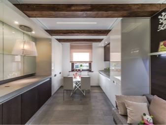
- Parallel. It is convenient to use in a one-room apartment. It is desirable that the footage of the kitchen segment, allocated from the common space, was at least 10 squares. This option involves the placement of furniture and household appliances along the opposite walls, and the organization of the dining area in the center.
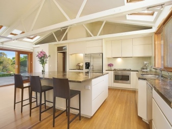
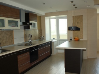
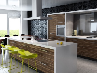
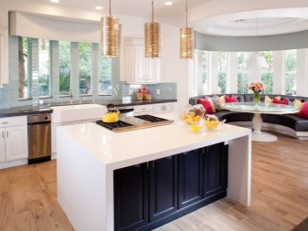
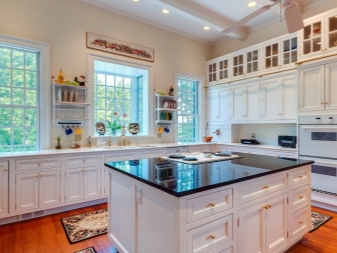
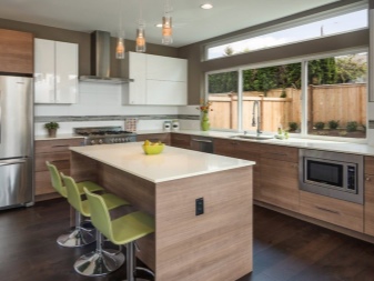
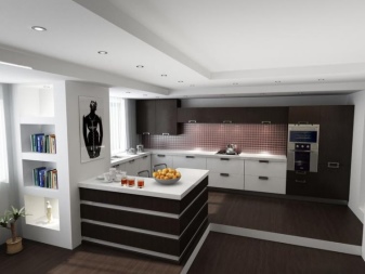
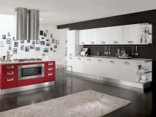
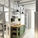
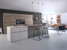
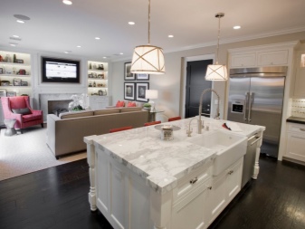
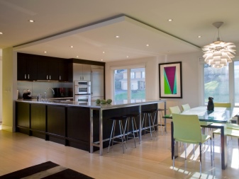
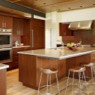
- Island. Many projects of kitchen-studios with an island are suitable for implementation in spacious apartments, and almost everyone can be implemented in a private house due to the lack of space restrictions. The main arguments in favor of choosing such a solution are convenience, ergonomics and practicality. The kitchen island conditionally divides the room into two segments without overlapping the entire space due to free access to the module from either side, while clearly marking the boundary of the kitchen-studio. Another type of island is the archipelago; it is a combination of the main multifunctional module and a low island.
We take into account the location of the windows
In order to rationally organize functional segments in the kitchen-studio, in addition to the size and shape of the room, it is important to consider which side of the world windows in the apartment are facing. It depends on the number of windows, how to arrange furniture, how many lighting systems will be needed and in which color palette to select finishing materials, kitchen furniture, other furnishings, accessories and textiles.
Examples of design projects
Apartments in modern residential complexes and houses of the old stock are often very different.In the first case we are talking about a free layout, which gives a weighty advantage in the design of the home. Owners of apartments of the old series realize their plans much more difficult. The idea of a studio kitchen is no exception. In typical one-bedroom apartments with a size of 20-30 square meters. m. kitchen area is only 3-7 squares.
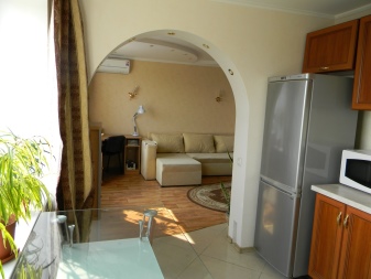
Planners "Khrushchev" endowed most of their creations with a bearing wall, which connects the kitchen and residential part of the apartment. This wall must not be completely dismantled. Therefore, it remains to resort to the installation of load-bearing columns and the installation of an arched opening.
For small apartments with a problem bearing wall, the option of partially combining the kitchen with the living room is best suited. One part of the wall adapts to the bar counter and a wide doorway is left. This solution has two advantages at once - the partial separation of functional areas and the unhindered access of natural light to both rooms.
You can use one or more methods of zoning for the proper organization of space in a small room.
Mark the boundaries of the functional segments and create visual effects of volume will help:
- Properly selected furniture.
- Creating multiple levels.
- The use of sliding partitions.
- Color combinations.
In practice, it looks like this.
- When the ceilings have insufficient height, it is not always advisable to change the level in the whole room, and it is not safe to move in a limited space. In such a situation, it is most appropriate to raise the level of the floor, and to create a visual effect that increases the height, use vertical cabinets with a glossy surface of the facades.
- Color delimitation. The floor covering of the working area is made light for a visual increase in volume, and the dark floor will mark the border with the rest area. A similar task is solved by the combination of finishing materials: tiles are used for the kitchen floor, and the rest of the space is played up with floorboard or laminate.
- Design in a certain style. You can organize a border zone by equipping the bar, which is welcomed by styles such as loft, fusion, hi-tech, eclecticism. Due to the allocation of the working part, the total space is more structured. You can use shades of one line of the spectrum or a contrasting palette.
How to equip and put the furniture?
So that the kitchen and living room do not contradict each other, but become a single space, abrupt transitions between functional segments should be avoided. It is best to mark the boundaries with natural partitions - furniture, contrasting trim, floor level differences. However, the principles of furniture arrangement and design in an open-plan room will differ.
Kitchen area
Here the arrangement of furniture, to one degree or another, is subject to the location of communications. The center of the whole composition in the kitchen segment is the work triangle: stove, sink, refrigerator. Built-in appliances are installed in order to save space, while giving the interior a neat and solid look. Active use of vertical space when the microwave is installed above the oven allows you to use the vacant space for additional storage systems.
Optimal floor design in the work sector involves ceramic tiles. The kitchen apron, in addition to its main function, acts as an accent element.On the walls use washable wallpaper or paint that is resistant to moisture and temperature changes. Finishing the dining sector may be similar to the living area. In the kitchen segment, stretch ceilings sometimes make a lower level than in the living room.
Living area
Finishing of the walls and the ceiling here is allowed absolutely any, the main thing is to adhere to the chosen design concept. The floors are finished mainly with laminate, wood flooring, carpet. As for lighting, you can limit yourself to a chandelier, and if this is not enough, add interior floor lamps, wall lamps or table lamps.
To visually highlight the living room, a large sofa is ideal for marking the invisible border - a regular model or an angular type design. In addition to interior partitions, shelving, false walls, the kitchen segment can be separated from the living room without the effect of weighting the space with the help of cotton curtains or light curtains.
Styles
In order to create a harmonious environment in a single kitchen-studio space, it is desirable to choose one stylistic solution for all functional areas.Although it is possible to pick up stylistic directions that are close in meaning without obvious contradictions with each other. Consider the signs of the most popular styles of interior design.
High tech
The kitchen-studio in the style of high-tech hi-tech is the territory of technical innovations and environmentally friendly materials. Usually nano-style denies a variety of palettes, but the kitchen is an exception. Here a close neighborhood of bright walls, furniture facades, intense contrasting color combinations, rich textiles and ultrafashionable metal tableware is allowed.
Three color options are used:
- monochrome - the classic arrangement of furniture in the spirit of minimalism, the dominant colors are gray and white;
- contrast - a modern suite, walls with a bright finish and a wide dining area;
- saturated - modern design in soothing colors, and its original makes it possible to combine neutral natural shades.
Requirements for furniture - functionality, conciseness of forms and bright design. For the fronts of the kitchen set, polished wood, frosted glass or laminated chipboard is best suited.
Loft
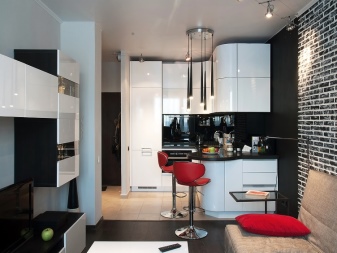
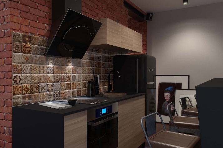
The original purpose of the loft - an adaptation for the life of industrial premises. Kitchen space, decorated in the attic style, should be extremely simple and consist of three parts - the working segment, dining room and recreation area. Most often, kitchen studios demonstrate a monochrome color palette, where white is combined with brown, gray shades or create a black and white contrast. But it is important to consider compliance with the color scheme of the living room.
In the monochrome design to the snow-white walls, ceiling and furniture there is a rich parquet and ceramic tiles for the apron. In a rich interior should be a contrasting kitchen set, made in a neutral palette. Special refinement is given by the combination of textures: matte, glossy, shiny chrome on different surfaces.
Requirements for the setting:
- simple, maximum functional pieces of furniture that form a single ensemble;
- use of various lighting systems to identify and highlight the boundaries of functional zoning;
- kitchen sets with a simple geometry of forms, without decorative delights. The palette is white or gray;
- home appliance design should provide the maximum number of parts made of plastic or metal.
Scandinavian style
Scandi design for practicality and naturalness, preferring natural finishing materials, especially wood. This direction is suitable for arranging the kitchen-studio of any shape and footage.
Character traits:
- Combinations: wood + stone, wood + glass.
- Neutral light palette.
- The simplest sets of furniture, where each item is multifunctional and practical.
- The minimum number of bright accents.
Kitchen set is better to choose with smooth facades without fancy accessories and too much decor.
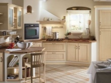
Provence
The interiors in the style of French country are considered to be among the coziest, warm and comfortable.
Signs:
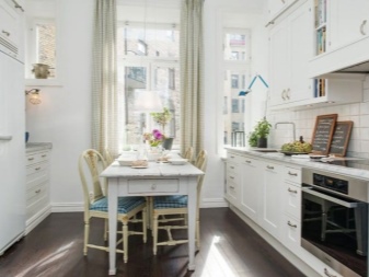
- The dominant palette of pastel shades - beige, lavender, milky, white, pearl gray, pale lemon.
- Artificially aged furnishings.
- Abundance of flower compositions.
- Exclusively natural textiles - Linen tablecloths and napkins, cotton towels.
- Decor self made.
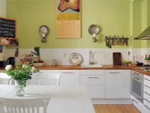
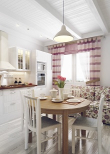
In the bright interior of a small kitchen space, kitchen facades of a sandy, ocher, light yellow shade look spectacular.Pastel variations of pistachio, olive, mint are well used in the design of the walls and for the furniture ensemble.
Colour
Following fashion trends in the world of interior design is tiring, and there is no need, it is much more efficient to analyze new trends and highlight the most important. In addition, there are universal colors, due to which the kitchen-studio will be in trend not one or two seasons, but at least for several years. Visual proof of the following options.
Interiors in bright colors
The unique properties of the white palette are irreplaceable when necessary:
- create visual effects volume in a small space;
- correct the lack of natural light in rooms with windows that face the north side;
- make the image of the room easier, airy and casual.
Often, in the studio kitchens, the ceiling, walls and floor of all segments are decorated in the same manner. The exception is an apron. This in itself is not bad, but when it comes to a bright finish, you need to be careful. When the white palette begins to dominate, there can be no trace of the individuality of the room: with blurry borders, loss of form is almost inevitable.Therefore, we can not neglect the contrasting accents. In this capacity stands the furniture, lamps, decor and textiles.
Careful selection of each detail of the situation is the key to the successful implementation of a harmonious light interior.
Contrast combinations
Contrasts in the interior will never lose their relevance. In addition to the ability to make the atmosphere dynamic, they become the best assistants in creating the most original images of the premises. And it is not necessary to be a professional to masterfully use contrasting combinations.
Combine light colors with an endless palette of dark shades and get spectacular accents to emphasize one or another feature of the interior design.
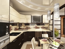
The possibilities of dark colors also allow you to visually enlarge the space. Visually extend the room can kitchen set, if at the top of it is bright, and at the bottom - dark.
Beige palette
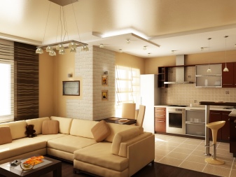
Do you want a cozy kitchen-studio or you need to increase the degree of heat in the interior - pay attention to the beige color scheme. Alternating shades: light beige, white and sand in combination with light wood, the atmosphere is light, very warm and inviting. This will be appreciated not only by households, but also by guests.
Grey colour
Neutral gray shades remain popular for several seasons in a row. This is due to the universality and practicality of the gray color, which can beat the premises of any purpose, including the kitchen-studio. In the working segment of the kitchen area there is a high concentration of steel gray due to household appliances, sink and stainless steel utensils.
The winning backdrop for a spectacular metallic sheen is a gray-white combination. As a result, the interior is balanced and the room looks noble and elegant. To increase the color temperature, integrate the decoration and decor of wood or materials that mimic the beautiful natural design of wood.
Bright colours
Without creating the effect of “bright spots” as accents, a spacious combined premise of a kitchen-studio can look monotonous. Contrast finishing with bright, cheerful shades will help to dilute a boring situation. Landmarks in this case is the layout of the room and the location of the windows. Based on this, choose where the wall will be accent - in the kitchen segment or the living room sector.
Remember that bright surface finish is allowed to be used in the interior only once,and the design of the remaining planes should remain monotonous.
Lighting options
If the windows in a small kitchen-studio are not enough, or as a result of the redevelopment, the kitchen area is generally located far from sources of natural light, then this disadvantage will be easily corrected by artificial lighting. Lighting systems are convenient to perform zoning, creating stunning visual effects of increasing space by almost half of what it really is.
Designers skillfully beat the combined versions of kitchen-living room with spotlights, LED-strips and their various combinations.
Given the large area of the combined room with high ceilings, you can use such an effective design method of zoning, as the distribution of ceiling and floor levels. A multi-level ceiling with integrated lighting helps to create a visual border for the kitchen segment with a seating area.
When a spacious room provides several functional areas, then you need to illuminate each segment. Ceiling lighting is used to provide clear invisible boundaries, and floor lamps in combination with wall lamps can illuminate the living room, highlighting the relaxation zone separately.
In the kitchen area, along with ceiling lights, you can use the capabilities of diode strips and equip them with wall cabinets at the bottom to illuminate the working surfaces.
Tips
Regardless of the size of the apartment, open plan gives a feeling of freedom and spaciousness. To get a comfortable, functional, externally attractive and harmonious combined kitchen-studio space, carefully think over all the details. The rational use of each centimeter of usable area helps to optimize the available space.
What to do:
- Buy a powerful, but silent hood, thereby solving the problem with odors, drops of fat and air purification.
- Use energy-saving appliances with quiet brushless inverter motors, working without jerks and noise. With this technique you will not be disturbed by loud noises and huge electric bills.
- Take care of finishing materialsable to withstand high humidity and temperature fluctuations and facades resistant to frequent sanitary processing.
- Provide a sufficient number of convenient storage systemswith which to maintain order is much easier.
- Get light, mobile pieces of furniture. Models of transforming tables equipped with wheels allow you to save on the purchase of a separate coffee and dining table.
And the last. Make the kitchen segment a logical continuation of the recreation area and do not overload the situation.
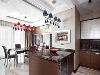
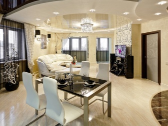
Beautiful photos of the interior of the kitchen-studio
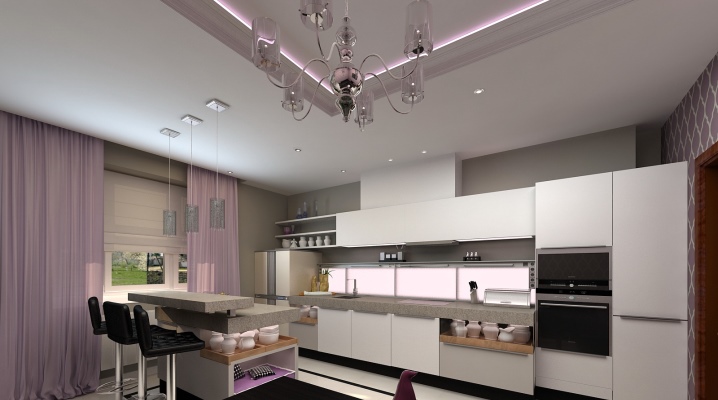
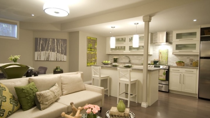
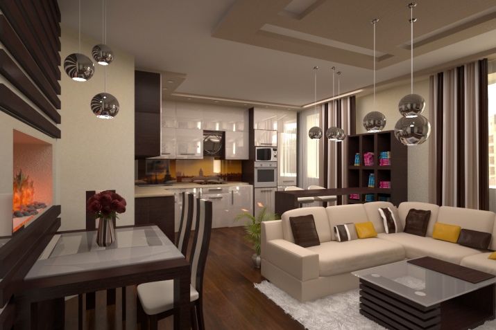
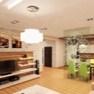
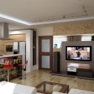
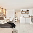
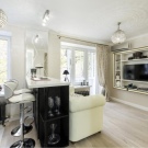
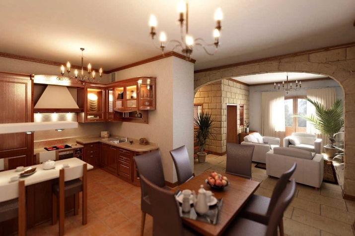
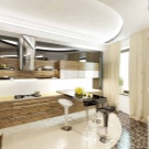
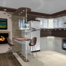
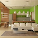
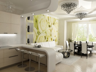
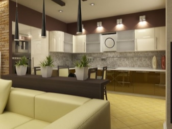
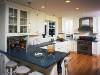
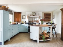
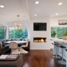
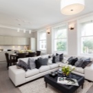
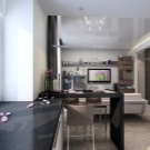
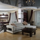
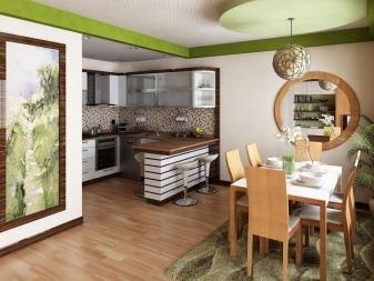
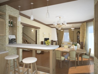
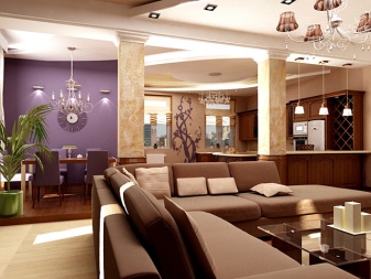
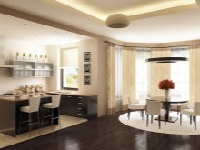
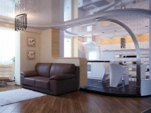
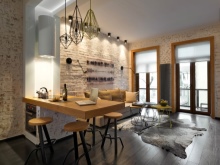
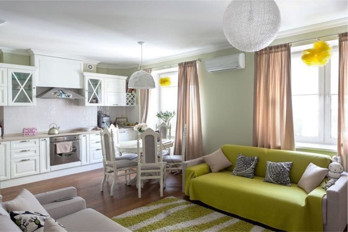
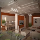
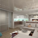
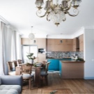
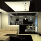
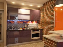
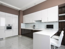
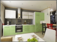
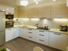
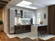
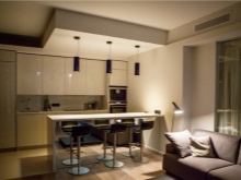
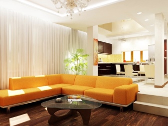
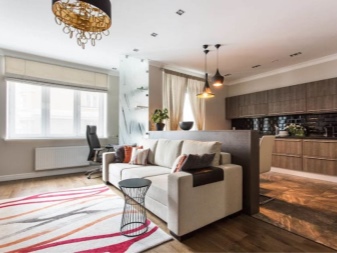
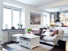
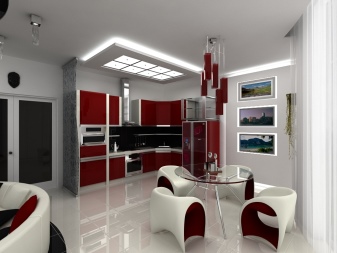
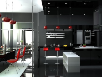
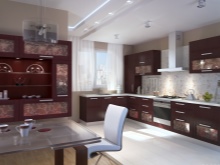
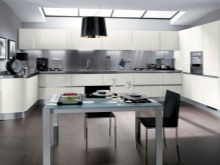
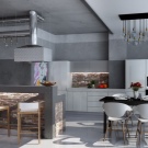
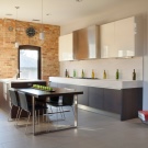
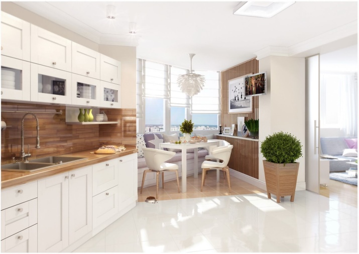
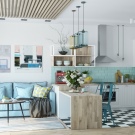
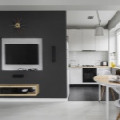
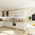
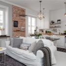
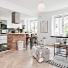
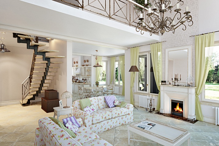
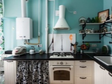
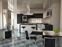
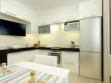
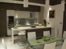
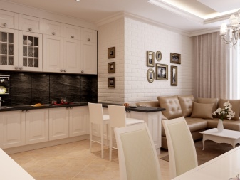
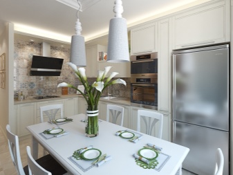
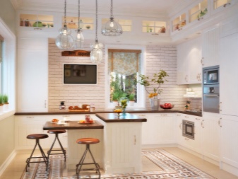
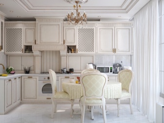
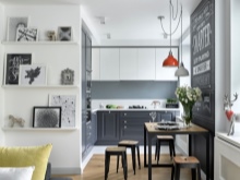
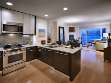
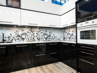
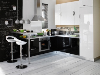
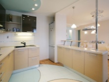
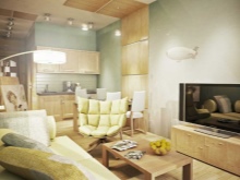
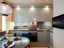
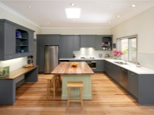
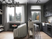
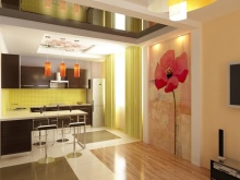
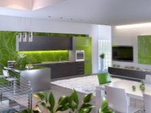
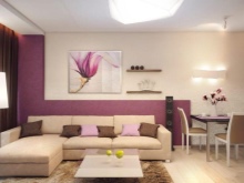
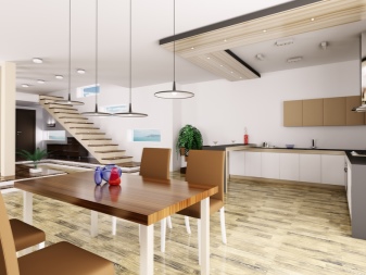
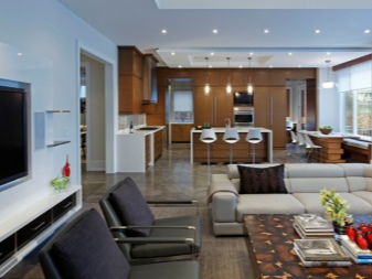
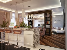
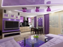
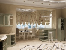
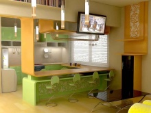
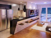
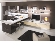
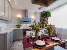
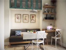
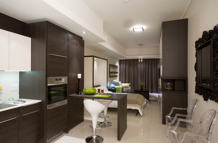
In the photo selection, there are kitchen studios with different layouts, decorated in different styles and colors.
See the next video for more ideas on kitchen design studio.
