Design studio apartment 21-22 square. m
Design of a small studio apartment of 21-22 square meters. m - not an easy task. We will discuss in this article how to arrange the necessary zones, arrange the furniture and what color range to use.
Special features
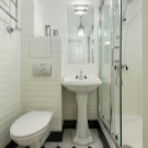
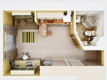
The apartment in which the kitchen is combined with a single room is called a studio. In a separate room allocated only bathroom. Maybe even a dressing room. Thus, it turns out that the kitchen-living room will be divided into functional areas: residential, for cooking and eating.
The main feature and advantage of this layout is the lack of doors, stealing a lot of space for opening. In addition, in such a room is easier to create an ergonomic design.
The concept of a studio apartment appeared relatively recently and housing with such a plan can only be purchased in a modern house. As a rule, developers simply rent out four walls without a separated bathroom. Thus, tenants can plan its area, location and geometry based on their needs and desires.
The positive side of the independent organization of the bathroom is particularly relevant for apartments of 21-22 square meters. The development of the design of such an apartment requires a special approach, since literally every centimeter needs to be saved.
We develop a design project
Development of the project should begin with determining the required areas for the bathroom, kitchen and dressing room. Accordingly, it depends solely on individual needs. Note that this also needs to take into account the geometric shape of the room and the presence of structural niches, grooves and corners - they can help make more efficient use of space. In a niche or deepening, you can organize a dressing room or workplace.
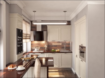
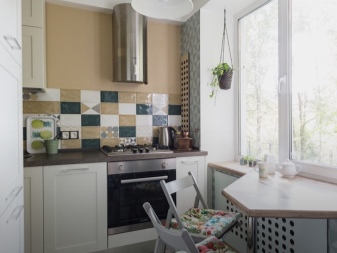
In such a small room it will be difficult to organize a full kitchen.In most cases, it is placed along the wall of the bathroom and consists of no more than three sections, one of which is a sink. As a rule, the size of the kitchen is reduced by reducing the work surface. Modern electrical appliances can solve this problem. For example, a slow cooker, electric frying pan or aerogril. They can be removed at a time when they are not used, freeing up space on the desktop.
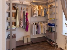
The question of storage in such apartments is solved by using the entire space of the walls up to the ceiling. Also the exit become mezzanine. In modern design, they become an additional element of decor and save from lack of space.
It is best to make storage furniture to order or use modular designs. Thus, it is possible to occupy all the free space of the wall reserved for the storage area. Note that designs that occupy the entire space from the floor to the ceiling look more aesthetically pleasing than the cabinet and do not create the effect of cluttering the space.
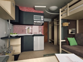
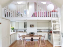
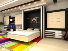
In the living area can be placed a folding sofa or bed. The bedroom can be arranged on the additional floor above the bathroom and kitchen.The bed can also be located above the sofa in the guest area.
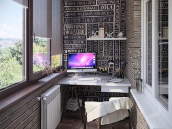
If the apartment has a balcony, there will be an additional area that must be included in the design project. If the construction of the house allows and the wall of the balcony can be demolished, a great place for a sofa, table or bed will appear. If not, then the balcony can be warmed and equip the storage area, recreation or workplace.
We arrange the furniture
The area of 21-22 square. m requires a competent arrangement. Furniture is best to choose a simple form and monophonic. It is worth noting that the furniture that transmits light, facilitates the perception of space.
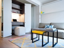
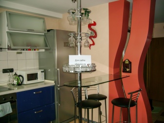
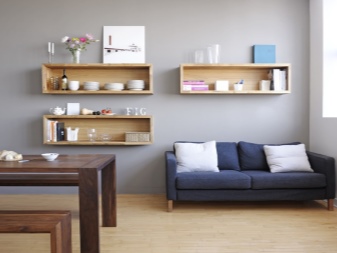
You can make a glass bar or coffee table. The rack will be perfectly replaced by hinged regiments. They are usually hung over the sofa and TV.
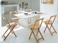
For such small apartments there are quite a few practical solutions in the category of transforming furniture:
- folding dining tables;
- folding beds;
- folding chairs;
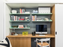
- shelves with built-in desktop and much more.
Color solutions
Small rooms are recommended to make out in bright colors. This also applies to furniture. The less it stands out in general terms, the freer the tenants will feel. Furniture can be white, beige or light wood.
The walls and ceiling are best made white and the floor contrast. Such a floor delineates the boundaries of space. When it merges with the walls, a closure effect can be created. However, in this case, you can make dark or bright baseboards.
Colored ceiling visually falls below and, accordingly, is not recommended. Note that pull the room up vertical lines, but in small quantities. These can be spread apart colored curtains or painted elements of the storage area.
You can add colors due to bright accents: pillows, paintings, shelves, curtains or other decorative elements. Note that the excessive use of small objects, such as vases, figurines or pictures, litters the space. Therefore, you should be very careful in this process. The same applies to personal items, like books or boxes. We can recommend placing something in decorative boxes and wrapping books in identical covers.
Interior ideas
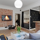
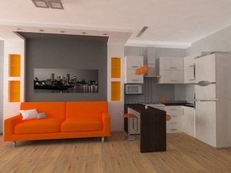
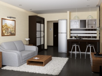
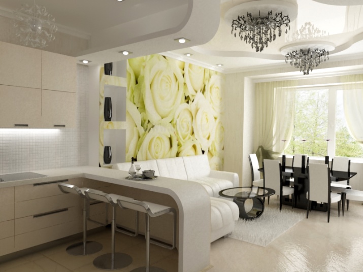
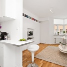
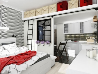
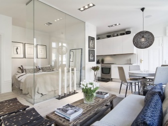
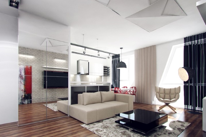
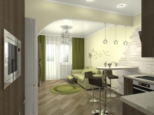
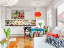
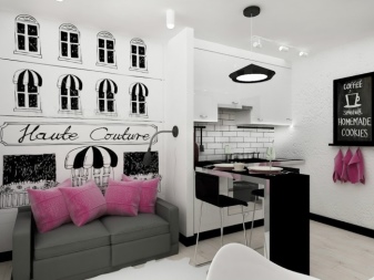
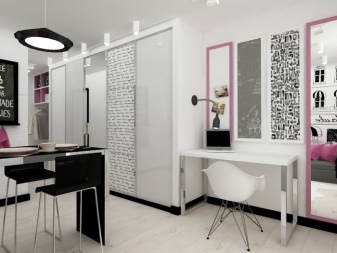
Let's start with an interesting design in a fairly contrasting range. This interior is an excellent example of the competent use of bright accents. The dominant color is white.Light walls, furniture and floor allow you to use not just bright elements of decor, but even black furniture and abundant painting. And to delineate the boundaries of space, as we have said, used black plinths.
I would also like to note the zoning and placement of furniture. A small partition between the kitchen set and the sofa together with the bar counter unobtrusively separate the zones from each other. A white desktop fits perfectly into the space and continues the dressing room, as it were, and in the ensemble with a white chair it is absolutely not striking. The combination of open and closed storage area is very convenient. Open sections allow you to quickly and easily take daily used items.
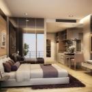
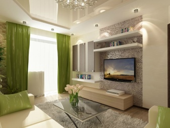
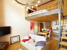
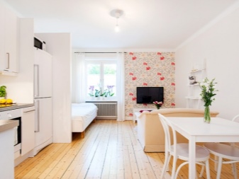
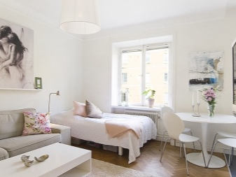
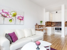
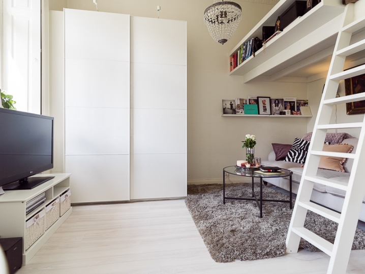
In the following example, I would like to highlight the use of the loft bed, not only as a bed, but also as an additional storage area. The gray carpet highlights the whitish floor against the background of light walls. Also note the concentration of small items in one place: on the couch and on the shelves above. Books, photos and pillows are collected in one corner, and not dispersed throughout the space. Due to this, they decorate the interior, but do not litter it.
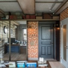
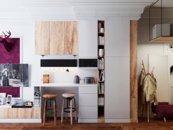
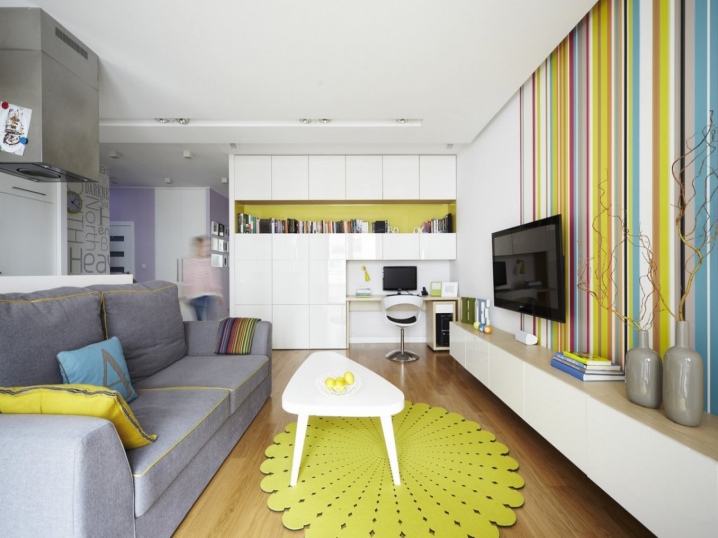
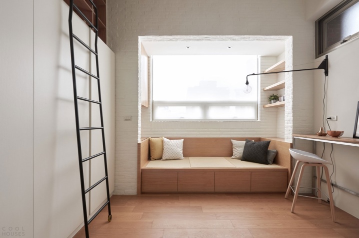
And finally, consider the interior in the style of minimalism.It differs as much as possible using various methods to increase the storage area and a minimum of decorative elements. In addition to a large wardrobe with shelving to the ceiling, there are additional compartments in the sofa podium and under the stairs. Inside the loggia above the sofa are also suspended shelves and a wardrobe. Tables located along the wall, you can move. Thus, in one position they perform the role of a convenient workplace, and in the other - zones for the location of guests.
