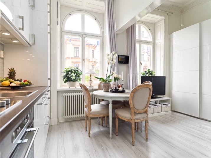
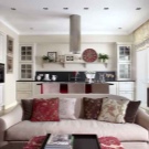
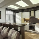
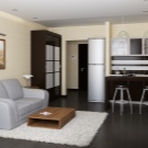
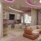
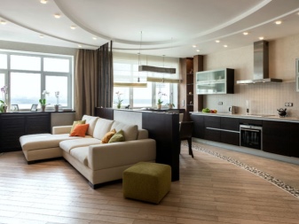
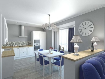
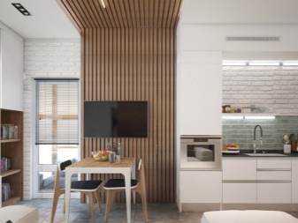
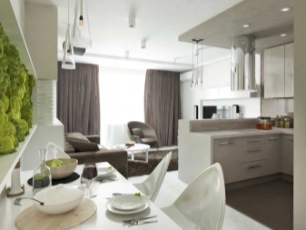
Design of a kitchen-studio with an area of 15-17 square meters. m
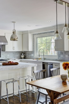
One of the most significant premises in an apartment or house is, of course, the kitchen. In some apartments its area is very small and many would like to expand it. Following modern trends, most people decide to combine a kitchen with an adjacent room, thus transforming an ordinary kitchen into a studio kitchen.
Special features
The concept - the studio is not new. In a broad sense, this spacious room without impressive partitions with a special organization of space. The idea of combining a kitchen with a dining room and a living room in order to optimize the space came to us from Europe and America.To date, this layout is becoming increasingly popular.
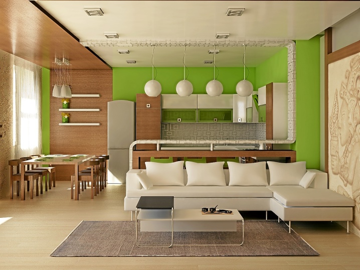
In this room more light and space, due to the absence of walls and doors. The room in the same style is divided into separate zones, due to the specific design. In each delineated space there are attributes inherent in the kitchen, dining room and living room.
The multifunctional interior of the kitchen-studio is used at the same time as a place for cooking and receiving guests.
We arrange the furniture
Competent arrangement of furniture in each area of the kitchen-studio will allow you to save space as much as possible, make the room functional and comfortable for all households.
Design must begin with a zone designed for cooking. Having determined the place for washing, stove, refrigerator and working area, we proceed to the planning of the kitchen-dining area.
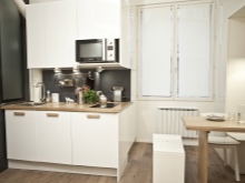
With a linear arrangement of kitchen sets, there is one wall. As a rule, this layout is combined with an island or peninsular.
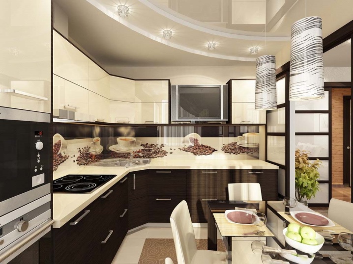
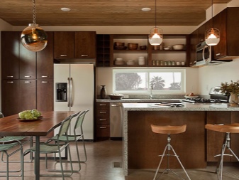
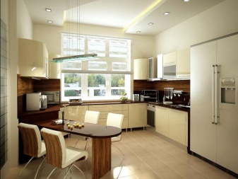
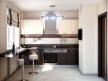
A great option for any kitchen is the placement of furniture in the shape of the letter G. This arrangement of furniture frees up enough space for the dining area.
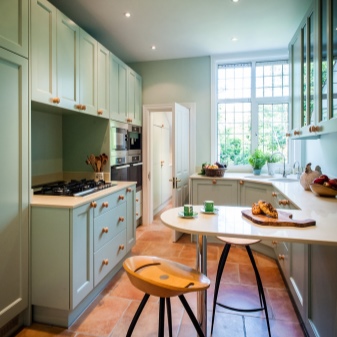
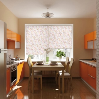
The layout, in which furniture is placed along both walls, is relevant for a room that has a narrow rectangular shape with one window. Some items are on one side and the other is on the other. The passage between the placed objects should be from 120 cm to 150 cm.
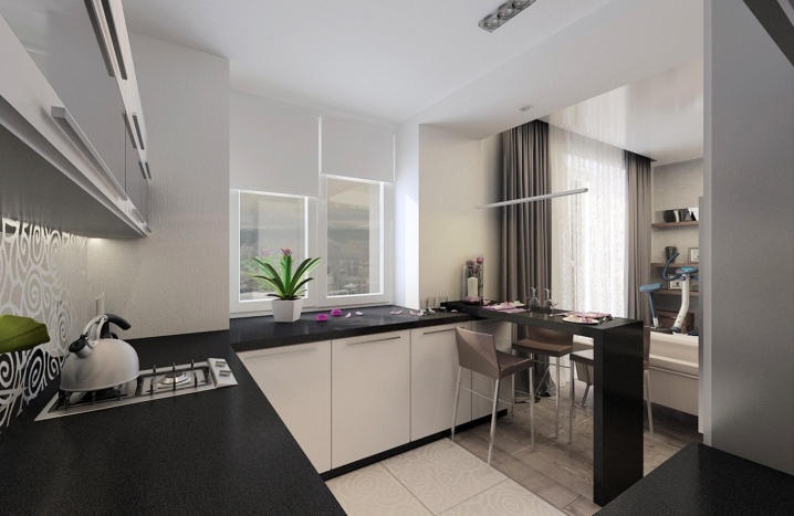
U-shaped - the most convenient layout in all respects. With this arrangement, it is possible to use the area by the window where the work area will be illuminated due to the penetration of daylight. The distance between parallel pieces of furniture should be at least one meter, and preferably 1.2 m.
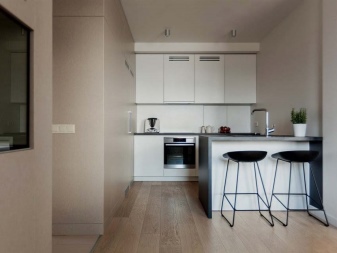
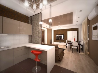
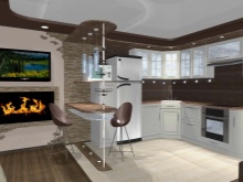
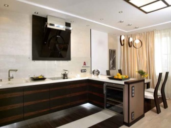
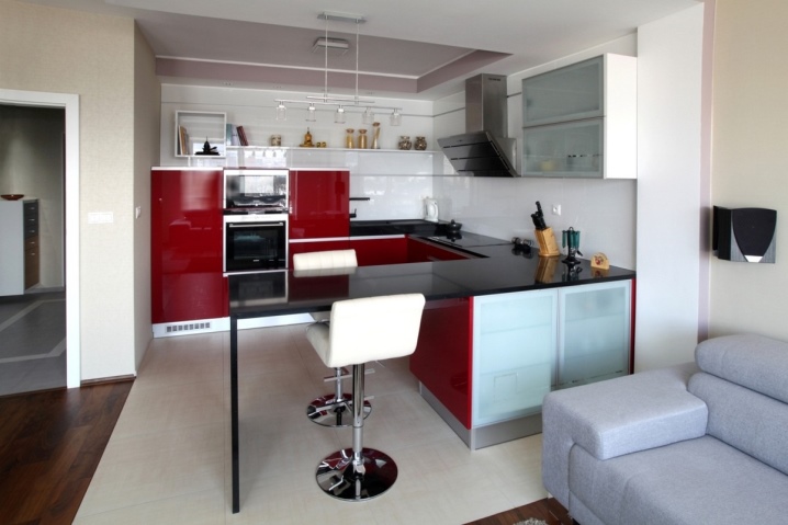
In the peninsular layout, one of the modules of kitchen furniture is installed end to wall, being a continuation of the headset. This allows you to clearly zone the space in the kitchen-studio.
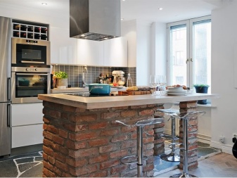
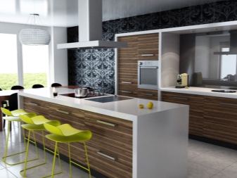
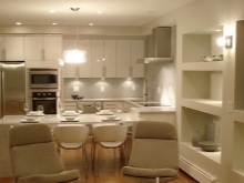
Island layout provides the location of the basic elements of the kitchen wardrobe in the form of the letter P or G, and one element is set apart. It can be used as a dining table or as a work surface with built-in kitchen appliances.
When placing furniture, it is necessary to observe the distance between the sink, stove and refrigerator - it should not exceed one meter.
The dining area is usually used daily and should be located as close as possible to the kitchen area. The dining area is always equipped with a table and chairs. If space permits, it is better to install a large table, but if the room is not very large, you can install a folding table.
Project Design Examples
One form or another will depend on the shape of the room intended for multifunctional use, on the number and location of door and window openings. In oblong narrow spaces, the furniture is located parallel to the windows. In the rooms of the form, which tends to square, you can place furniture for the three zones perpendicular to the windows.
For the delimitation of each zone in the studio is set a separate uniform lighting. Directional lighting fixtures are installed in the kitchen area. The dining area is located above the table. To illuminate the entire room using a chandelier or a few spot ceiling lights.
15 square meters m
In order to achieve coziness and comfort in such a small room, you need to make the most of every centimeter of a given area.There is no clear distinction between such an insignificant area, but a smooth transition is quite possible. It is better to divide the space in cross section. The kitchen area with an L-shaped or U-shaped layout should be placed in the far corner, the central part should be given to the dining area, and the rest area should be located closer to the window.
In a small room for a visual expansion of the space, the kitchen suite is selected either in the color of the walls, if you want to hide the kitchen, or in a close shade.
Furniture to save space is better to choose transforming. A folding table and chairs in the dining area will be a very good solution in this small space. The kitchen area should be equipped with the necessary built-in appliances: a small oven, a narrow dishwasher, a compact hob and a good extractor hood. Instead of a table and chairs, you can use a folding bar counter and high stools.
16 square meters m
For the kitchen in the 16 square. m. more planning solutions are available and the technical equipment of such an area will be more diverse than an area of 15 square meters. m
Arrangement of the kitchen area can be complemented by a bar, a buffet or a small storage room.Arrangement of furniture for this area is available in any way and depends on the shape of the room and methods of sectioning the space.
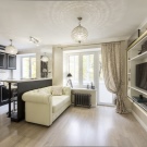
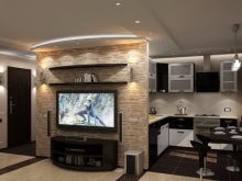
The longitudinal division of the room involves the placement of the kitchen unit along the wall in an L-shaped or linear fashion. The sofa and coffee table are located on the opposite side. The dining area is located in the center. TV in this case is hung on the wall above the workplace, part of the top drawers in this case is missing. Instead of a stationary dining table with an L-shaped layout, you can use the bar counter.
When dividing a room into zones, the best option for a 16 meter studio kitchen is to place a kitchen in the corner. In this case, you can arrange the kitchen suite on a peninsular or island basis.
17 square meters m
A room with such an area can accommodate a larger number of kitchen elements in comparison with the 16 meter space. For the kitchen area you need: a large fridge, a washing machine, a full cooktop and a sideboard.
Kitchen set can be arranged island or peninsular way. A large oval or round table and six chairs are set in the dining area.The living area is equipped with a spacious corner sofa, coffee table and TV.
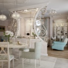
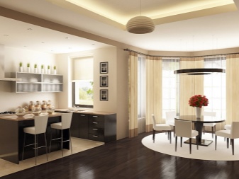
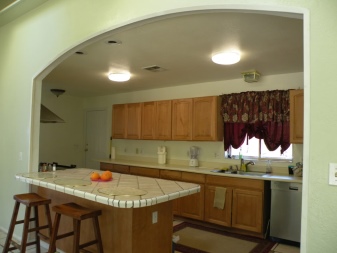
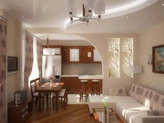
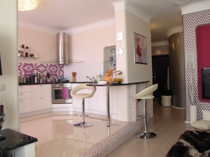
The kitchen-dining area can be zoned using an arch or a small partition, and can be raised to the podium.
The second tier as a way to increase the area
The task of each designer is to create a well-thought-out interior of a small studio, allowing the most efficient use of these square meters. In order to solve this problem it is necessary to invent, and then implement interesting, and sometimes very daring projects. Thanks to them, it is possible not only to correctly use the space provided, but also to increase it, due to high ceilings.
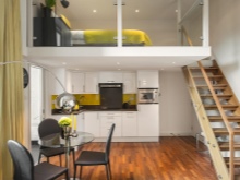
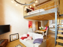
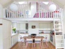
You can implement this idea with the help of the construction of the second tier, thus adding a few additional meters to the area. The second tier can be used as a bed. And on the first tier to arrange the kitchen, living room and dining room.
Color solutions in the interior
In the interior of the kitchen-studio color is of great importance. When you design a studio room is better not to use bright colors. As a rule, designers are limited to one maximum by two main shades, adding 2-3 additional ones.The design of the kitchen-studio, which has an area of more than 30 square meters. m, perhaps in any tone. In such a spacious room would be appropriate and light and dark shades. Interior decoration in completely dark colors is permissible only in the presence of large windows.
In a small kitchen-studio it is better to limit light and monotonous wall decoration. As a bright or dark accent, it is better to choose individual elements of the decor. It can be curtains, lampshades, upholstery in the living room and other elements.
To visually expand the space of the kitchen unit facades, it is better to choose light shades (white, milky, light beige) with a glossy surface.
Interior ideas
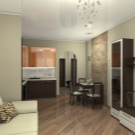
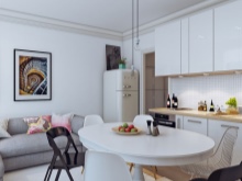
Studio with L-shaped kitchen unit with a large dining table and six chairs.
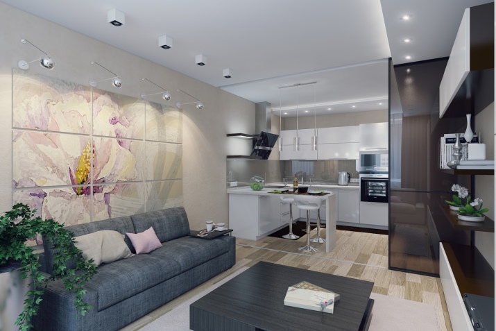
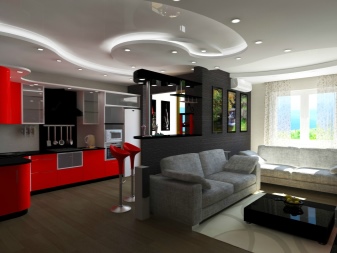
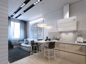
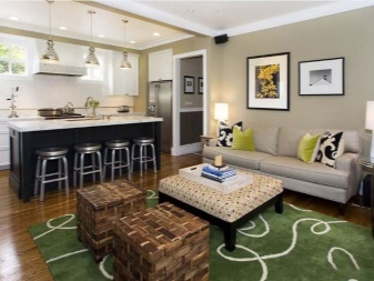
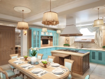
Island arrangement of kitchen set. The island, on the one hand, serves as a bar counter and separates the kitchen from the living room, and on the other, it is used as a storage box for kitchen utensils.
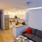
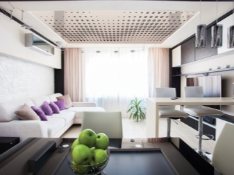
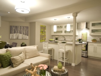
The peninsular location of the kitchen with a minimum number of top drawers and with a folding bar counter.
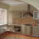
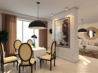
Separate kitchen-dining area with an arch.
Zoning the kitchen area using the podium.
