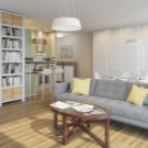
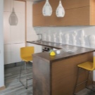
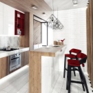
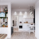
Design kitchen-studio area of 20 square meters. m
Interior design is always an easy task. Arrangement of several functional zones in one room complicates it even more. The article will talk about how to conduct zoning and furnish a room with furniture, what colors and lighting to use, how to hide studio design flaws and thereby save space.
Features of planning
The kitchen-living room can be in two versions. In one case, this is a one-room apartment in which the kitchen is combined with a single room.In the other - one of the premises, for example, in a three-room apartment or in a house.
In modern homes, quite often a large kitchen is provided and it will be quite rational to equip it with a living room. Thus, you can save the whole room. The peculiarity of this type of housing is the lack of doors, which saves a lot of space. However, the task of the designer is complicated by the need to accommodate several functional zones while maintaining the same style and aesthetics.
Considering a room of 20 square meters. m., we can say that it is a rather small room. But with the right approach, even it can be arranged ergonomically, beautifully and fairly freely.
If we are talking about the kitchen-living room, which does not perform the additional functions of the bedroom, study and dressing room, then everything is much simpler. It is quite easy to fit and a full kitchen, and a reception area. With a skillful approach, this room will become a modern decoration of the whole house.
Zoning options
In the studio apartment, zoning occurs throughout the area from the front door to the balcony. It should be noted that in new homes, apartments of this type are most often rented without a fenced bathroom.This is very convenient, because in this way future tenants determine its size and geometry based on their own ideas. Therefore, generally speaking, zoning includes the definition of a bathroom.
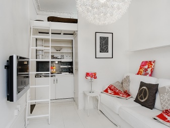
If we consider the issue of differentiation of functional areas only in the kitchen-living room, then, first of all, it is necessary to prioritize. Those planning to receive many guests will have to sacrifice the size of the kitchen or the presence of a separate bedroom. However, a bed can be arranged on an additional floor above the bathroom or kitchen. Then there will be a place for the location of a spacious sofa, a folding dining table, additional ottomans, chairs or armchairs.
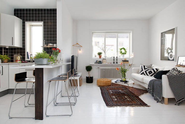
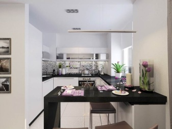
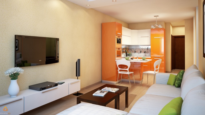
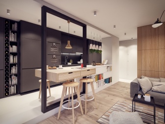
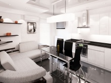
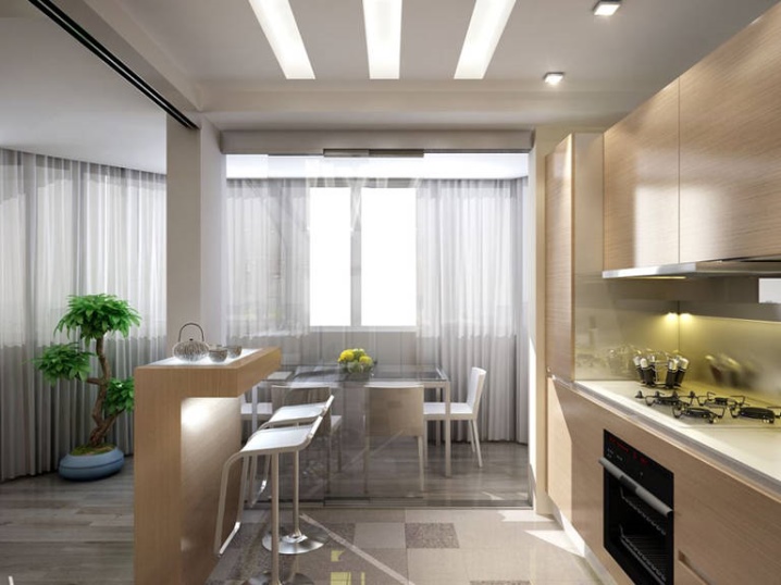
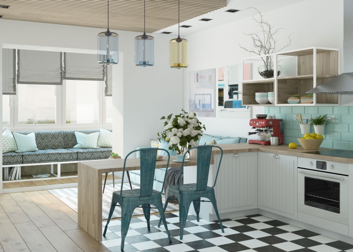
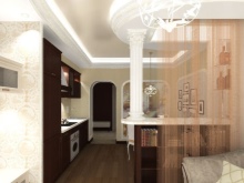
If there is enough sofa for two or three people and a bar counter, then the kitchen can be made larger. Together with the bar, it can be in the shape of the letter P, then the border between the kitchen and the living area will be quite clear. Especially this layout is relevant if the room has the shape of an elongated rectangle.
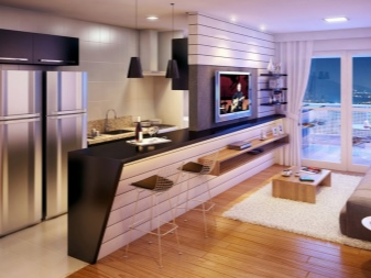
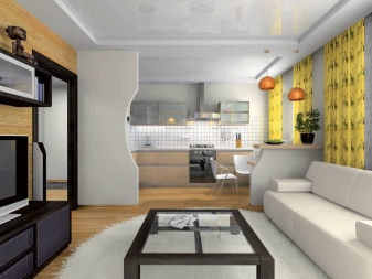
If the room is square, then along the wall it is possible to arrange the kitchen in one line, opposite to put the island bar counter.To her back to put a sofa, and on the contrary - the TV.
Those who do not like to sleep on folding sofas, you can try to arrange a separate bed. If planning allows, niches work well for this task. Otherwise, it can be organized by isolating part of the room.
In addition, it is necessary to determine the storage area. This is a very important stage, especially if there are a lot of things and it is impossible to equip a full-fledged dressing room. Some techniques for organizing additional storage sections will come to the rescue.
One of the options is mezzanines, which can also become an element of zoning. Such a construction under the ceiling will draw a line of demarcation, while leaving space on the floor.
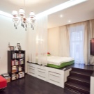
Also come to the aid of techniques such as the construction of a bed, a podium or a sofa. Inside the podium fit comfortable and roomy drawers.
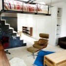
If you plan to build an additional floor for the bedroom, another locker can be located under the stairs.
If things are not so much, then fit a spacious wardrobe. Note that in a small room, you just need to use all the free space of the walls for greater capacity.Therefore it is worth buying or making a custom-made wardrobe to the ceiling. In addition, it will look more aesthetic than normal.
Zoning the kitchen-living room in a multi-room house is a simpler task. At 20 square meters. m free fit full kitchen with a large dining table and a spacious sofa with a TV. The most common and rational layout option - a sofa, located back to the kitchen and table. The TV in front of him will be visible to everyone.
Hide the minuses of the studio room
The disadvantages of this type of layout include, first of all, the noise of household appliances. Especially this question will be relevant at night. Therefore, a refrigerator, a washing machine (if it will stand in the kitchen) and a dishwasher must choose the most silent. The hood should be not only the quietest, but also quite powerful, since many cooking smells tend to be absorbed into the textiles of furniture and various decorative elements.
Also note that to preserve the aesthetics and additional noise insulation is better to use the built-in technology.
Another disadvantage of the studio is that any items left, for example, clothes or dishes, immediately appear on the eye and catch the eye.Therefore, it is better to buy a large dishwasher, which fits all the dishes without residue. Also in the bathroom is to equip a roomy and lockable compartment for linen.
Styles
The design of a small studio is best done in such styles that do not imply volume or ornate decor, a riot of colors and a lot of furniture. These styles include:
-
loft;
- minimalism;
- high tech;
- constructivism;
- Scandinavian or Japanese style.
An interesting solution would be to mix several styles. For a basis, you can take a laconic minimalism or practical constructivism and add any element of decor or furniture of a more saturated style. This can be an eclectic bed, an avant-garde mirror and a single fusion wall.
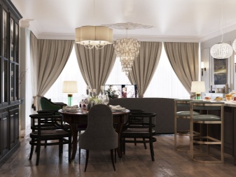
In a large apartment or house, all rooms are usually decorated in the same style. But there are exceptions. In any case, any style will suit the kitchen-living room, from classic to modern.
Color and lighting
For small rooms it is recommended to use light colors and small bright accents. On an area of 20 square meters. m, you can use a darker color scheme, for example, brown-green.It mainly depends on the layout of the room.
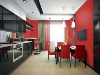
If you want to use rich or dark colors, you need to correctly place accents and, most importantly, choose the right furniture. It should not visually block the room. In addition, it is necessary to properly distribute the color between the ceiling, walls and floor.
It should be borne in mind that the color of the ceiling is visually lowered. The walls and the floor of the same color create a feeling of closure, so it is better to make the floor darker. And if the walls are made darker, then visually they will move towards each other.
However, there are techniques to help visually enlarge the room. For example, a colored floor in combination with white walls and a ceiling pushes the room to the sides and upwards. And separate vertical lines on the walls raise the ceiling. You can simply draw them in suitable places on the wall or pick up the right furniture.
This can be a closet to the ceiling with narrow sections. Sections should be of two colors, one of which coincides with the walls.
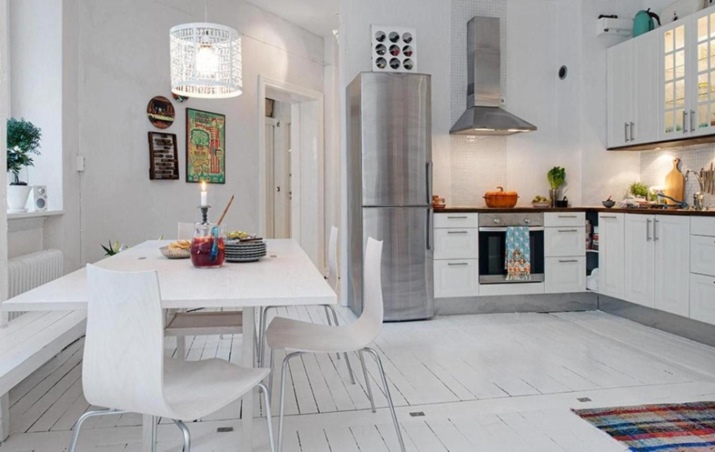
The issue of interior decor should also be approached carefully. Those who love various statues, bowls and lots of pictures or pillows are best to use white in furniture and wall decoration.In this case, only the decoration elements will be allocated, without creating a feeling of cluttering.
As for lighting, the more of it, the better. If due to the shape of the room there are dark corners, they can be decorated with additional lighting devices. Thus, the air and space will be more. Note that the excessive use of small light bulbs or lamps can play the role of excessive decoration and spoil the aesthetics. Therefore, the design of the light and various objects must be done in the complex.
How to equip?
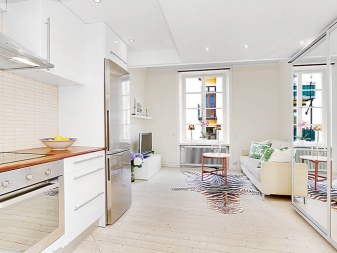
When making a room with furniture, it is necessary to take into account its color and shape. The more you need to put it, the easier it should be. If the room is small, then dark, variegated or ornate furniture will not give it space. To preserve the feeling of freedom, it is better to use light wood, monochrome and simple forms.
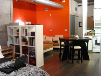
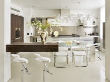
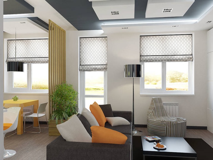
As for the arrangement of the furniture set itself, zoning can be carried out at the expense of it. A sofa, a bar and a shelving are best suited for this. Note that for small rooms it is better to use furniture that transmits light:
-
rack without back wall;
-
transparent plastic chairs or those whose back is not solid;
-
table with glass top.
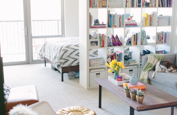
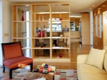
The rack can perform the role of a partition between any zones. The bar counter separates the kitchen from the rest of the room. With the help of the sofa, you can separate the bed from the guest, if you move it back to the bed.
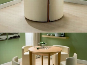
Note that today the market offers a large selection of transforming furniture:
-
coffee tables, turning into dinner;
-
the ottomans which are displayed in stools;
-
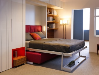
cabinets and shelves with folding beds and desks.
It should be noted that when arranging the room, windows, their number and location play a big role. In the corner apartment they can be located on two walls.
If the room has two windows on the same wall, they will help zoning it. The gap between the windows will play the role of a separator. Near one window you can place the kitchen, and near another bed or guest room. A dining table can be placed between the zones.
If a room with one window, then have a bed or a sofa next to it. But in some cases, the window manages to place a dining or writing desk.The wide window sill can also be turned into a tabletop. This technique will save quite a lot of space.
An interesting idea - the second tier
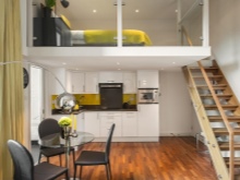
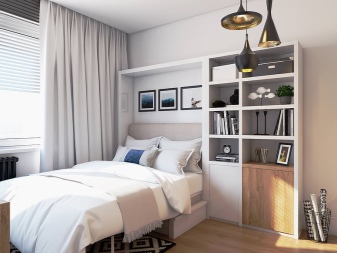
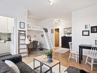
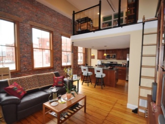
The presence of the second tier allows you to create several zones and at the same time save space in the room. Most often, it is used for arranging a bed. The best place to place will be the space above the bathroom and kitchen.
If the bathroom has already been erected and there is no possibility to redo it, then the output will be the construction of a bed, for example, above the sofa. In addition to the practical value of this technique will give originality to the design and will attract attention.
Tips
When designing the kitchen zone, it is better not to use traditional kitchen elements such as tiles, artificial vegetables and fruits, decorative jars and plates. All kitchen utensils are recommended to be hidden in cabinets. It is also worthwhile to provide cabinets for small household appliances that are not used daily and can be temporarily removed. It clutters the look as well as extra decoration or furniture.
In small apartments, curtains and curtains are widely used for zoning space. Most often they protect the bedroom area.Their advantage is in ease of attachment, the ability to change to others and affordability. In addition, the curtain can be fenced off and other areas, and if necessary, it easily moves away and creates a single space.
As we have said, the floor and walls of the same color create a feeling of isolation. Those who want to make white walls and floor can be advised to use contrasting baseboards suitable for the color scheme of the design. This technique highlights the shape of the floor and levels the described negative effect.
Ideas of modern interior
The modern interior is notable for a wide variety of styles. Each person can choose one or another design of his house in accordance with his taste and ideas about aesthetics.
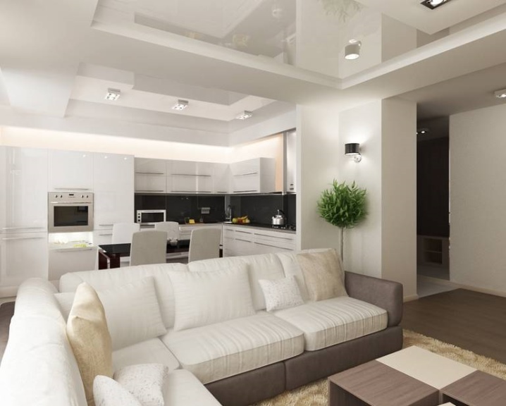
So, you can use discreet high-tech with an abundance of smooth lines, right angles, glossy surfaces and metal. Another feature of this style is thoughtful and varied lighting.
Creative individuals fit avant-garde with its variety of colors, unusual shapes and original images.
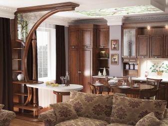
In modern design, a worthy place is occupied by the classics.The antique column or damask wallpaper will perfectly fit into the new interior and will demonstrate the refined taste of its owner.
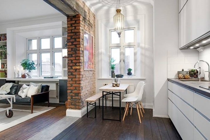
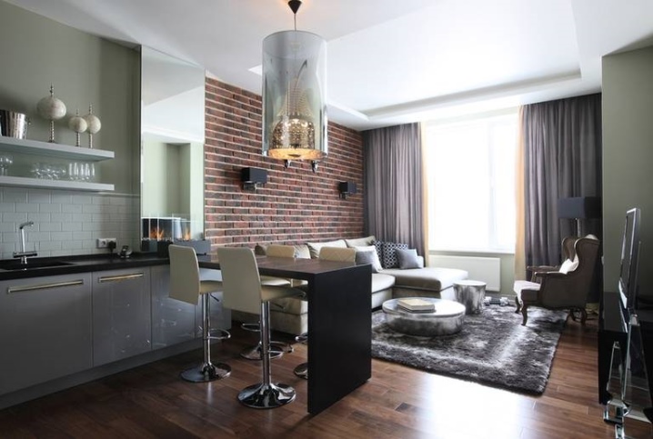
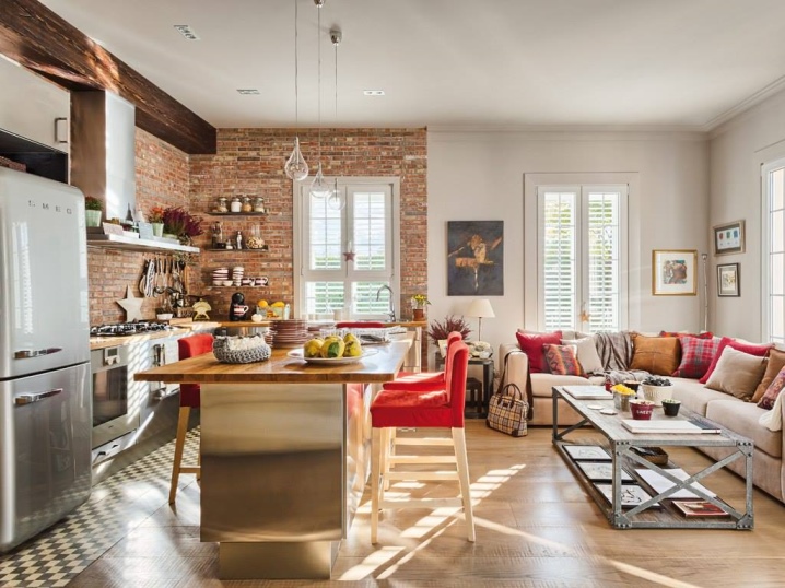
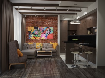
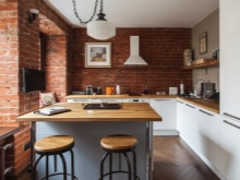
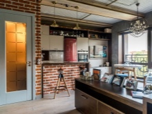
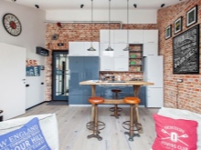
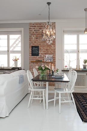
Brickwork is another interesting element of modern decor. In combination with a thoughtful design, it looks very original.
Design projects
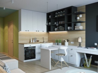
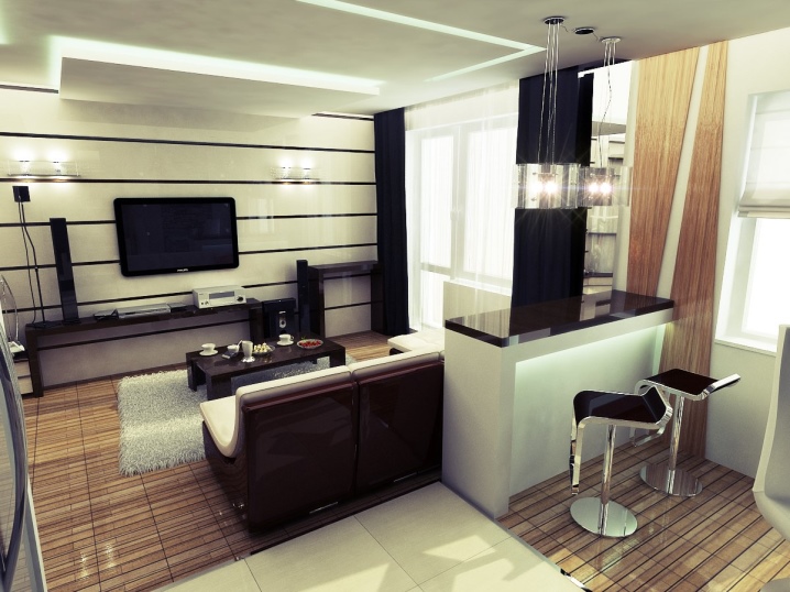
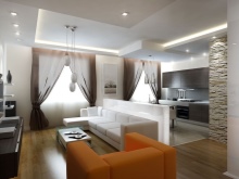
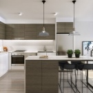
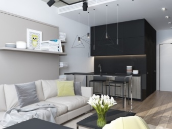
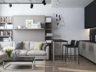
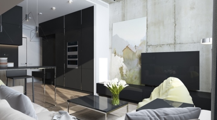
Most of the modern design is urban. The interior below is a mix of two styles. Lamps on long cables, safits and a concrete wall without decorative finishing are characteristic elements of a loft. A metallic and glossy surfaces, right angles, the backlight of the kitchen and gray color - the main features of high-tech.
Separately, it is worth noting the ways of zoning space: color, light and different levels of the ceiling. The black kitchen and light gray living room stand out, but do not contrast with each other. A bar, coffee table and stand for the laptop, made in the same style, create unity and connect the zones of different colors.
Also note that the arrangement used a rack with built-in hinged bed and a black wardrobe to the ceiling. The latter is not striking and is perceived as part of the wall.
This design is an excellent example of the correct use of black. Due to the distribution of dark and light accents, the interior is perceived quite easily.
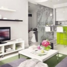
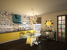
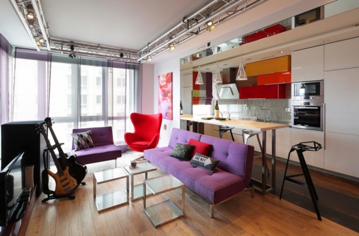
Now consider an example of a bright design in the style of pop art. The rich colors of the furniture are balanced by laconic forms, right angles, transparent glass and white walls and most of the kitchen. Also note the modesty of additional decor, which is limited to one poster on the wall and several pillows. Scenic spotlights and guitars harmoniously complement the musical theme of the style.
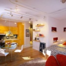
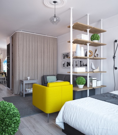
The following design example is distinguished by competent zoning. In one room there are four functional zones: a bedroom, a guest room, a dressing room and a kitchen. The bed is fenced off by a rack and a chair. They divide space well, but do not clutter it. A dressing room curtain creates comfort and, in combination with a coffee table, is an excellent element of zoning.
